Pink rock Airhead

Wishing you great health and happiness in 2025!

I am consciously stating the obvious when I write, spending quality time with family is limited when you live on opposite sides of the planet.

When we moved to Australia in 1998, my niece was a child. We are getting to know her and partner as adults whilst they take working holiday breaks from Spain here. Initially in 2018/2019 and again this year. We just spent a joy filled time swapping stories and creating happy memories with them over Christmas.

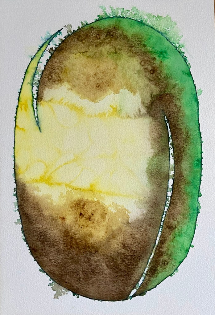
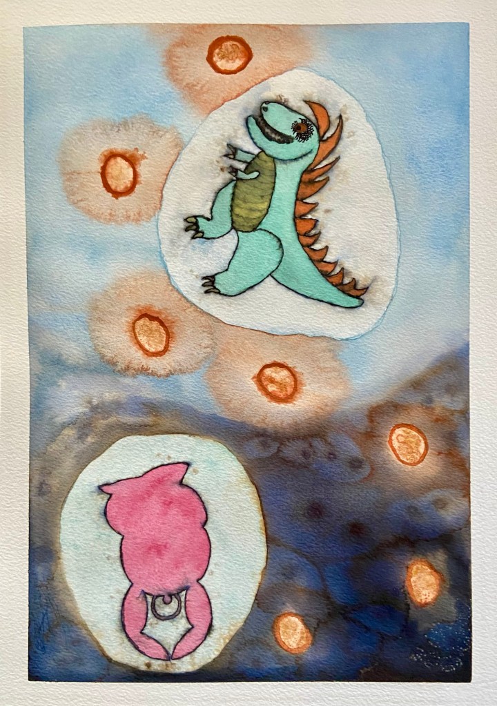
Whilst reviewing my sketchbook, my niece and partner were drawn to a rendering of a Pink Airhead from March 2024. They remarked on the way the character had developed over time.

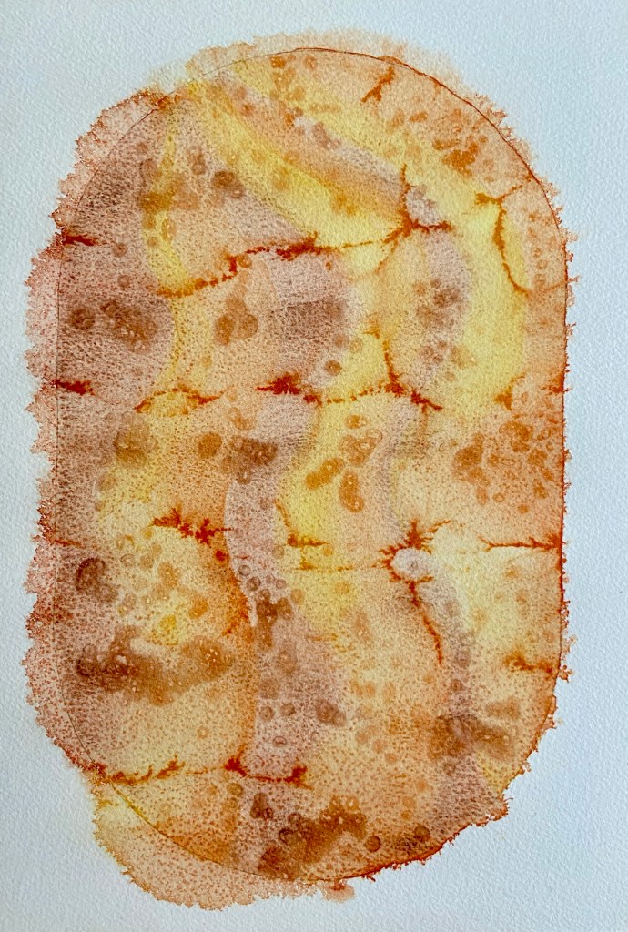
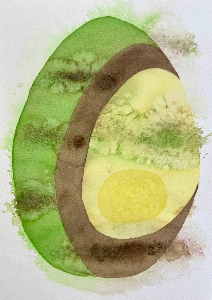
Today’s whimsical Airhead represents both outward airy lightness through the pink rocks/stones and inner darkness contained in the black outlines.

‘Pink rock’ is a play on words reflecting a lack of self confidence to display goth/punk/emo individuality. I believed, to be accepted, I had to hide my true self and conform to societal norms. I wonder where this belief began.

As a shy young teen distracted by fantasy, horror, sci-fi, and daydreaming, I expressed myself through coloured handwriting. Setting aside traditional black and dark blue, I favoured apple green and turquoise inks in my fountain pens. Both of them intermittently leaked over my fingers and exercise books. Also, I had a hot pink felt tip pen reserved for doodling, sketching, and creating organic shapes filled with circles/bubbles.

Going further back, in the first class of primary school 1968-1969, taught by Mrs J. Booth, I have three distinct memories: winning a prize for hand painting/printing; enjoying singing along to “The 59th Street Bridge Song (Feelin’ Groovy)” accompanied by guitar; and exposing myself in the communal handwashing area of the unisex toilets.

I have no recollection of the reason why, having removed all of my garments, I minced out, hands in the air from the cubicle like a bawdy butterfly emerging from a chrysalis. Nor do I remember any repercussion of my action.

Up until that point, I believe I was as carefree as any other five year old. I dressed my teddies, floated around like a bird, and coloured in.

Above is my report from the end of the first class of primary school. 3 (satisfactory) for conduct stands out from the 4 (good) grades. I suspect this was due to memory number three above.

Water abstract mixed media

On the back of the success of the fire oval and circle, I revisited water in the round. Above is the result.

I applied multiple washes in shades of blue, turquoise, and green.

I sprayed water onto the whole to create dappling and to soften the edge. Clean salt was added and removed twice to reinforce the darker splodges.

The ovoid version including less washes and recycled salt is included again below for comparison.

Fire inspired

I had an idea of sinuous flames of ox blood, yellow, and orange flames undulating from the bottom of an oval to left of the top.

Spraying water and adding salt resulted in the above picture.

My husband suggested I try a circular watercolour that could be printed on a tee shirt. This abstract mixed media piece is the result from last weekend. Two washes intensified the colours.

Water inspired

Final abstract mixed media A3 painting

This abstract mixed media painting was inspired by the colours of water over submerged sand islands viewed whilst descending towards Cairns off the coast of Far North Queensland, Australia.

Concept sketch 1
Concept sketch 2

Whilst on holiday in Port Douglas, using my husband’s 1980s Winsor and Newton Sketcher’s palette, I completed a couple of concept sketches on A6 cartridge paper.

After returning home, I started with a pencil oval outline filled with light watercolour washes in acqua, blue, and green. Texture was created by adding large clean salt crystals that absorbed the water and hues.

The outline was inked in and more washes added.

First draft

Water was sprayed on sections of the picture freeing up the colours to merge, and the edges and outline to soften. Darker shades were added to the water droplets and encouraged to flow into each other. Salt recycled from other paintings was added to create random patches of soft brown and pink.

The above was repeated a few times until the final version emerged.

Jack’s bean

This is essentially green yellow brown no. 2. Inspired by a feather from my husband, the split on the left echos the way barbs separate. The shaft is represented by the right hand white curve from base to two thirds up.

The pristine blue ink outline was softened by spraying water onto the still wet Winsor and Newton watercolours.

Early on salt was added to the yellow area resulting in the undulations. After three layers of green and brown, salt was used to develop texture.

I am happier with the way this mixed media abstract painting came out. My husband said it looks like one of Jack’s beans that grew a mighty stalk linking his home with that of the giant.

Green, yellow, brown abstract mixed media

Quite a while ago, in fact when exactly is vague, I designed a zigzag pattern using a watercolour brush in a painting app on my iPad. Its purpose was specific, the background panel for the title block on this blog.

My husband returned home from walking Stan with the gift of a feather. We think it is from a rainbow lorikeet because of the green and yellow colours. I decided to use it as inspiration for a watercolour.

Being fond of ovoids, I sketched out an idea and painted the first wash. A few more layers followed.

Horizontally, it looked a bit like a misshapen footy ball. In portrait it resembles an avocado. At this point, I sprayed water onto it. A soft outline formed from the wet edge. Rivulets of colour settles in the warped dips of the contorted paper. I added reused salt crystals and left it to dry overnight.

The zigzag pattern remained in the back of my mind during the process.

I added the darker yellow oval, fresh salt and darker areas to the green and brown topped with recycled salt.

I think this is the finished piece.

Work day mask

When travelling to and from work, I have backpacked: laptop, headset, headphones, compact umbrella, face masks, cotton bags, hand sanitisers, tissues, wallet, keys, key card, pens, pencils, eraser, sketchbook, propelling pencil. When possible, capture moments. The following and sketch above filled fifty minutes.

when one is really quite weary
how dreary dearie
surreptitiously seeking inspiration
questions
no right asking even if strong featured person opposite is known
consciously combined cosmetics for commuting?
muted tones without shading to avoid notice?
only one or one of many masks?

Harmony in nature

Harmony in nature, abstract mixed media

Last Saturday, having gazed at the bookcase from my chair, I was inspired to create something using three ceramic pieces modelled on nature. A leaf, a shell adorned cornucopia, and a hyacinth leaf vase.

I arranged and drew around the objects in pencil then ink. I decided on purple for the cornucopia using the colour of mussel shell for inspiration, predictably green for the leaf, and finally orange for the vase.

On Sunday, I thought the shapes I had chosen worked well together as there was movement between them from the colours intermingling. Wishing to add depth and luminance, I added yellow washes to the orange and green and redid the ink outline.

After deciding the abstract picture was called harmony in nature, I added three black undulating lines to ground and orientate the central image.

Airhead connects with Rawr

This was my first foray into fountain pen ink sketching and an ink wash. The Parker Qink dried extremely quickly. I diluted it, painting onto dry paper.

The ink is from a time of my youth in the 1980s, the Parker Sonnet pen, a gift from work colleagues when we left the UK to emigrate to Australia in 1998.

My naïveté continues to be a theme. I had not considered the inked lines would run when with watercolour was added. I worked with it.

Aging and some of the medication I take have a side effect of shaky hands. I used one of my pencil sketches of a dinosaur. I cut the sketch out, pencil shaded the outline and inked in the outline.

The painting developed as it was created.

Salt was added to the night sky, the background of the ovoid contained figures, and the centre of the seven orange shapes. They represent one thousand miles markers across the Pacific Ocean and the equator from South East Queensland to California.

It is night time where I am, represented by pink Airhead. I engage with my blogging buddy Ra as Rawr the dinosaur through thoughts, dreams, and engaging with each other’s work.

The painting can be viewed with night at the bottom or the top.