Orange

I am fascinated by colour.

As a child the primaries satisfied my palette choices. Since then I prefer the blended results, being drawn towards, orange, green, and the naturally occurring browns in timber, cane, etc.

Throwing into the mix, lighting, shade, and texture; my senses are abuzz.

Memories of Weston-super-Mud

FAT man photos recently posted images of Weston-super-Mare. They reminded me of the last time I was there, fourteen years ago.

A day trip from Worcester, with my husband, late Mother and Step-Father no.2 (SF2). In my memory it remains a sunny and happy day, filled with colour.

This is even taking into consideration, the annoyingly loud deh-deh-di-deh and blarb noises from SF2’s traffic light and speed camera warning device; allllll the way there and alllll the way back. Oh, and the electric wheelchair running out of juice, and a proliferation of disabled-toilets that were moonlighting as furniture storerooms and changing rooms. Much to the chagrin of my Mother.

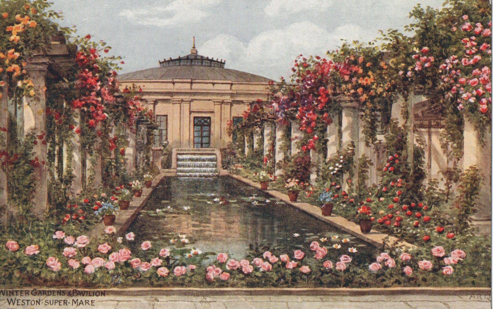
I have been to Weston two or three times. The first when around nine or ten years old, in the 1970s. Foggy memories of a postcard from the time. Winter Gardens backdrop to a long pool, flanked by flower draped arcades.

I imagine we would have made this journey by train or coach from Birmingham. One of the first holidays with Mother, Brothers, and Step-Father no.1 (SF1). I vaguely remember staying in a bed and breakfast and visiting a family who lived on a caravan park. I distinctly remember sketching an older boy reclining on a bed.

The beach, made up of sand then mud seems to go out for miles, towards the elusive sea. Within the family the beachside town was known fondly as Weston-super-Mud.

The second time was on the way to somewhere else, in the 1980s with Richard, my late best friend. Of that day, memories of cold wind and rain remain.

Colour compensation

There was a time when I would make a point of going for a walk at lunchtime. Since the construction of the light rail has picked up pace, the dust, sounds of heavy machinery and pavements being closed have stymied my weekday routine. 

This week I had to go to the bank. Something I used to frequently do, before my dependence on online transacting. 

While the journey up High Street to Randwick was noisy and visually unpleasant, I was rewarded with this glorious scene while ambling along Blenheim Street, on the return trip. The combination of textures, colours and shades was compensation enough for my weary senses. 

Tropical croton 

When living in the U.K. I tried to keep a croton. Attracted by contrasting bright vibrant splodges against the darkest green background, this indoor plant, in the cooler climate, received plenty of attention. Then one day, inexplicably, all of its leaves dropped off. Like other specimens that did not survive my care, the croton species fell firmly into the ‘too hard’ basket. 

Fast forward twenty years or so, I realised that, given the right environment, the croton is relatively hardy. We have two in a pot, in the garden, in Sydney. They seem to prefer being in part shade, tucked in amongst other plants. 

This particular beauty appears to be thriving in its tropical, Port Douglas home. 

Afternoon heat

  Sydney is experiencing unusually warm and humid weather for Autumn. Yesterday was no exception 30+oC and humidity in the high 80s even with cloud cover. 
This light yellow ochre painted house is one of my favourites in Leichhardt. I slowly made my way home from Norton Street yesterday afternoon.  I was struck by the vibrant and contrasting colours of the magenta flowers against the dark green trees. The hazy appearance of the picture is due to the light coming from the behind the yew. 

Why grey?


For a number of years it has been popular to paint your house grey. I wonder if this pair of houses would look different if the mouldings on the house on the right were picked out in a contrasting colour or shade. I personally prefer the colour palette used on the left, what do you think?

Nothing in particular

DSC01852-0.JPG
In a bid to make space on my iPad I was merrily deleting pictures when I came across this one. At first sight a leafy space in the local park containing bouganvillea. The contrast of focus from blurred to sharp and the vibrant colours captured my attention. I particularly like the juxtaposition of green, brown, red and mauve.