I am always amazed by surprises from the universe. Our focus over Yule was our fifteen year old fur child, Stan. He had surgery on 29 December to remove a kidney, spleen, and two benign tumours.
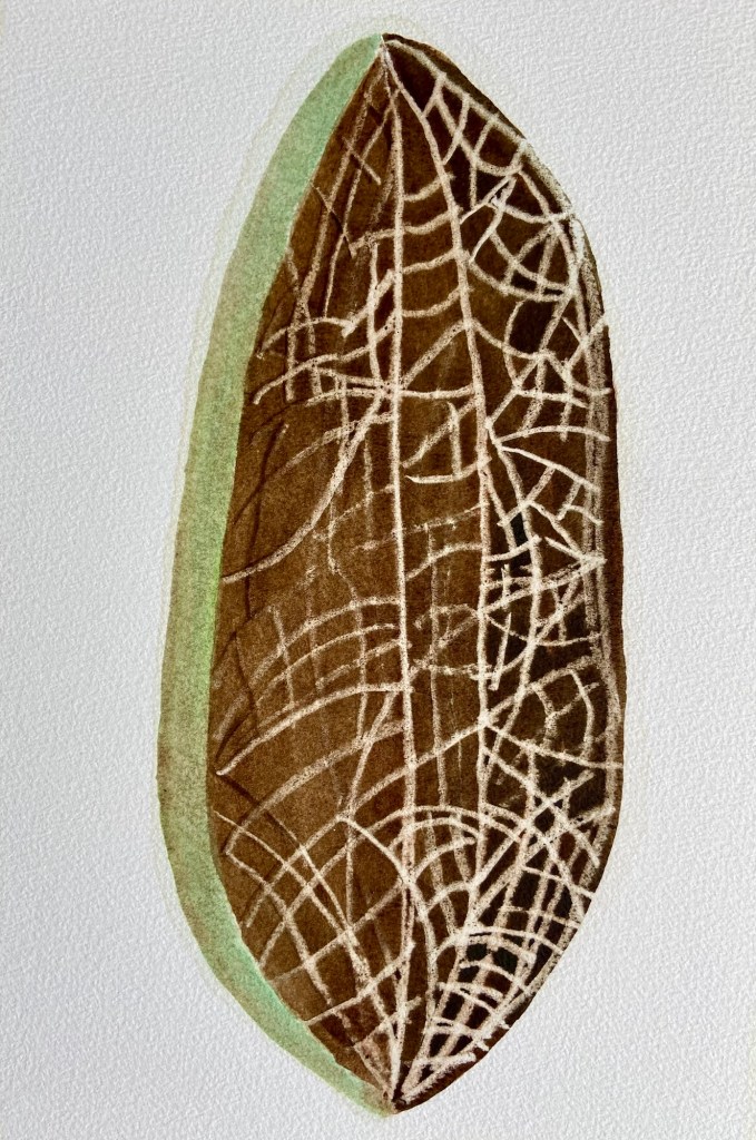
The other day returning after a gentle walk, we slowly climbed the two steps into the side entrance to the building. There amongst the tree and vegetation detritus lay a seed pod. Its markings reminded me of a street map layout.
What a roller coaster ride, That was twenty twenty-five! Recently read my water snake Was stretching, expanding from within. Facing unknown, challenges, changes. Inner growth facilitating shedding skin. Ah-ha! Building up, rather than breaking down Preparing to jump aboard, The galloping fire horse of twenty-six.
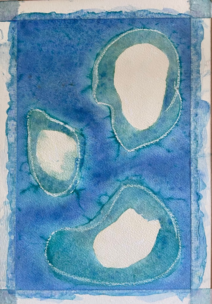
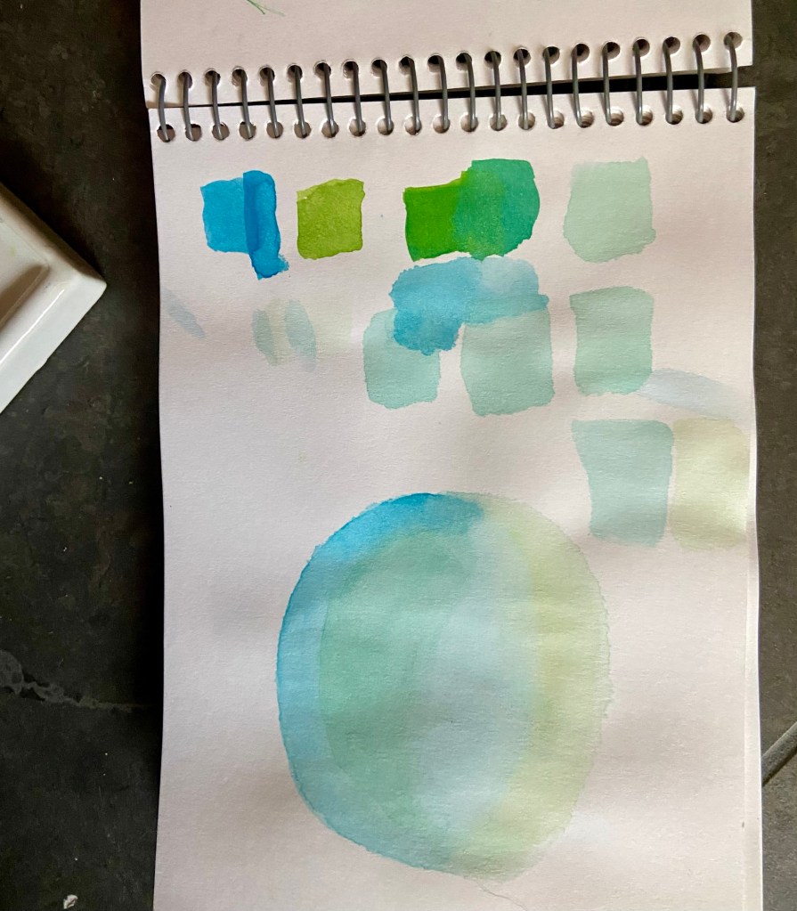
Flying between Brisbane and Cairns, in October 2024, I glimpsed sand surrounded by turquoise tropical waters, dropping away to deeper blue depths through small starboard panes.
Hastily taken snaps on my phone helped me to remember the moment. During the next twelve months, I tried out some of the colours in water element paintings.
Retracing the route, a year later, proved to be the catalyst for developing imagined sand bar shapes and layouts.
This A6 sized organic sketch was to be the design, on four times larger, A3 paper. At the last moment, I decided not to pencil an outline. I drew three shapes using the edge of a candle, saved from my niece’s birthday in September this year.
Relying on the light catching the wax on paper, viewed across the surface was hit and miss. I accepted whatever happened would what I would work with.
Beginning with thin turquoise washes, the white outlines emerged, revealing the paper beneath. The white reminded me of the waves gently breaking on unseen barriers.
When satisfied with the colour, I added recycled salt crystals to add texture. Next the inky depths began to form.
Again using wax resist, the exposed sand outlines were added along with light yellow ochre glazes. Adding wax to the sand and glazing with burnt umber provided streaks of matter caught in rivulets.
I usually start and finish a painting in a few hours. On this occasion, the creation process stretched over two delicious days.
A large antique rose hued ovoid defines my 61+ years’ past. Subtle changes occur as new wafer-thin memories settle in layers, one upon another.
Arrogance, discourtesy, and challenging behaviours of others incessantly stain the past. In time, angry bruises fade to blotches, finally morphing into smirches and dots.
Emotions, beliefs, and self-recriminations jostle in gentle stewing ere burgeoning into recollections, reminders, remembrances.
Silent brain-wringing turmoil.
Above an etheric pale grey-blue future floats – seemingly innocuous – yet ominously waiting.
A paper-white, irregular circle pierces both rose and blue: authenticity within the calm of the present.
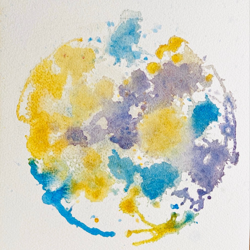
I considered presenting a blank sheet. After all how do you paint something unseen? Weightlessness came to mind, such a heavy word to describe something ethereal; unseen, lighter than a feather.
My imaginings are viewed through a water element induced feelings lens. Increasingly with age, earthbound gravity anchors me as I am dragged along the ground like a hot air balloon basket being divested of collected paraphernalia. It doesn’t seem to matter how much is discarded I just can’t seem to get my carcass of the earth.
Both versions of the abstract watercolour are posted here.
The first feels heavy, constrained, forced, and overworked.
I am happier with second version.
I was aiming for:
Purple for spirit, and I believe, evolved thought
Yellow for the air element, in my view also sunny hope filled optimism
Blue resonates for me as free limitless sky high thinking
While white space represents light and calm
A decade or two ago, I was fascinated by people who read a book while completing gym based cardiovascular training. In contrast, I felt like I was soaring as I listened to dance music. The beats, sounds, and crescendoing voices motivating my body to pump and work harder to lift me higher and higher.
Nowadays, finding the music in the gym too loud, I can’t be bothered to try to compete with my earbuds. Dialling up the volume sets off my tinnitus. I can complete forty minutes’ exercise in the aerobic heartbeat zone while reading a book on my phone. It works on the reclined bike, elliptical trainer, and treadmill.
This abstract mixed media painting was inspired by the colours of water over submerged sand islands viewed whilst descending towards Cairns off the coast of Far North Queensland, Australia.
Concept sketch 1Concept sketch 2
Whilst on holiday in Port Douglas, using my husband’s 1980s Winsor and Newton Sketcher’s palette, I completed a couple of concept sketches on A6 cartridge paper.
After returning home, I started with a pencil oval outline filled with light watercolour washes in acqua, blue, and green. Texture was created by adding large clean salt crystals that absorbed the water and hues.
The outline was inked in and more washes added.
First draft
Water was sprayed on sections of the picture freeing up the colours to merge, and the edges and outline to soften. Darker shades were added to the water droplets and encouraged to flow into each other. Salt recycled from other paintings was added to create random patches of soft brown and pink.
The above was repeated a few times until the final version emerged.
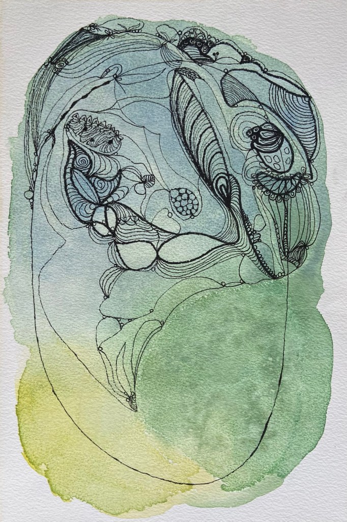
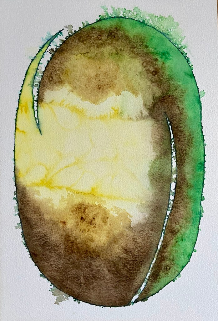
This is essentially green yellow brown no. 2. Inspired by a feather from my husband, the split on the left echos the way barbs separate. The shaft is represented by the right hand white curve from base to two thirds up.
The pristine blue ink outline was softened by spraying water onto the still wet Winsor and Newton watercolours.
Early on salt was added to the yellow area resulting in the undulations. After three layers of green and brown, salt was used to develop texture.
I am happier with the way this mixed media abstract painting came out. My husband said it looks like one of Jack’s beans that grew a mighty stalk linking his home with that of the giant.
For the last two years I have been in a state of threat at work. While the employer proclaims it is a place of inclusion and authenticity, I wonder if this statement relates only to the loud and pushy at the expense of others. Perhaps I am not resilient enough, unwilling to speak out, and too sensitive.
When my values were tested too much, I fought back (in a shy introverted way). I was labelled ‘emotional’. I resorted to my go to fawn response with underlying frustration and at times anger. I aimed to please and appease by sacrificing myself.
Over the last twelve months, somehow, I sustained this tiring performance, achieving a personally unnecessary glowing annual performance review. Satisfactory would have been enough.
When I recently found out the perpetrator was being reassigned, I felt numbness and disbelief.
I developed fawning from ages 9 to 16 years. The seemingly constant aggression directed at my mother and brother by my first stepfather brought firsthand experience of rage, domestic violence, and abuse. I largely kept my thoughts and feelings to myself. Withdrawing my marshmallow being behind a protective shell. As soon as I was able, I fled away to college.
At the beginning of this week, perpetrator free, I felt like a huge weight had lifted from my shoulders.
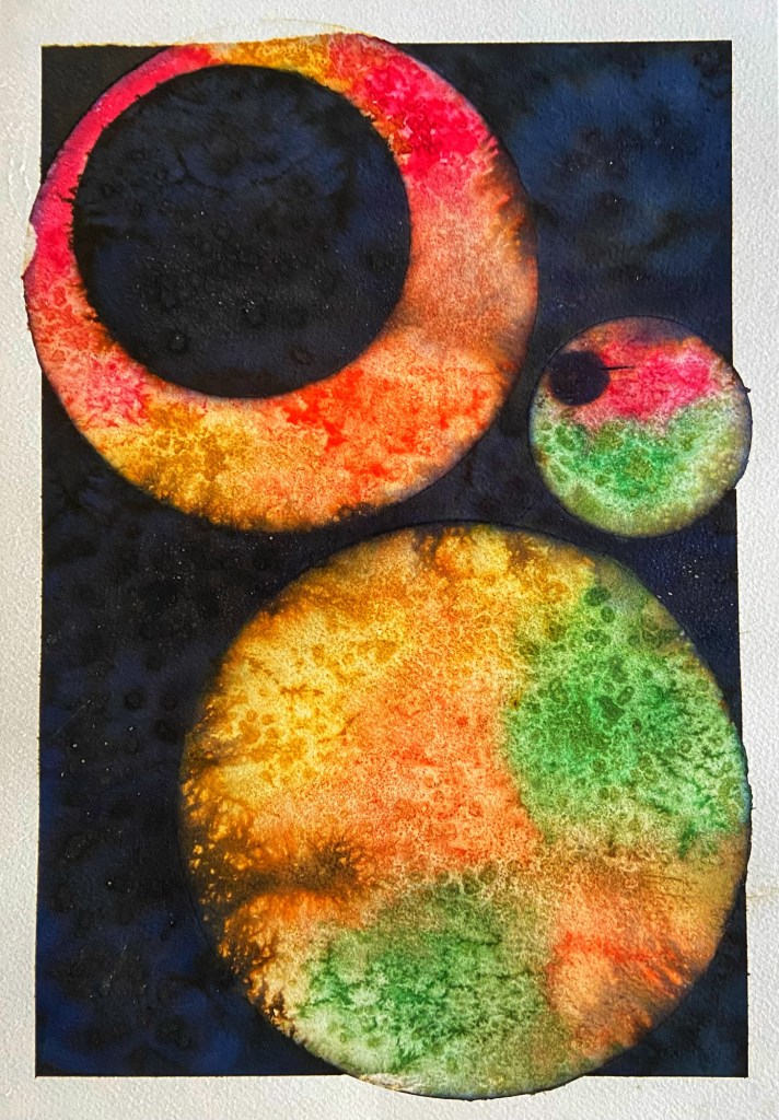
This painting reflects pleasing and appeasing while dark emotions and discontent underlaid my view of my workplace. The grey background represents compromise, neutrality, control, and practicality. I am represented by an anonymous outward facing ovoid, outlined with dark blue and red inks. The teal inner self displays responsiveness, integrity, and practicality. It contains pink organic shapes of kindness, caring, and compassion; essential for my role. Salt adds fractures to the composition.