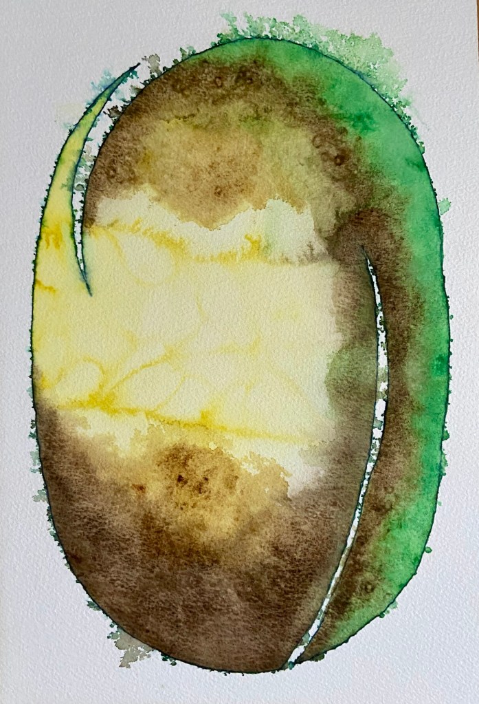
This is essentially green yellow brown no. 2. Inspired by a feather from my husband, the split on the left echos the way barbs separate. The shaft is represented by the right hand white curve from base to two thirds up.
The pristine blue ink outline was softened by spraying water onto the still wet Winsor and Newton watercolours.
Early on salt was added to the yellow area resulting in the undulations. After three layers of green and brown, salt was used to develop texture.
I am happier with the way this mixed media abstract painting came out. My husband said it looks like one of Jack’s beans that grew a mighty stalk linking his home with that of the giant.
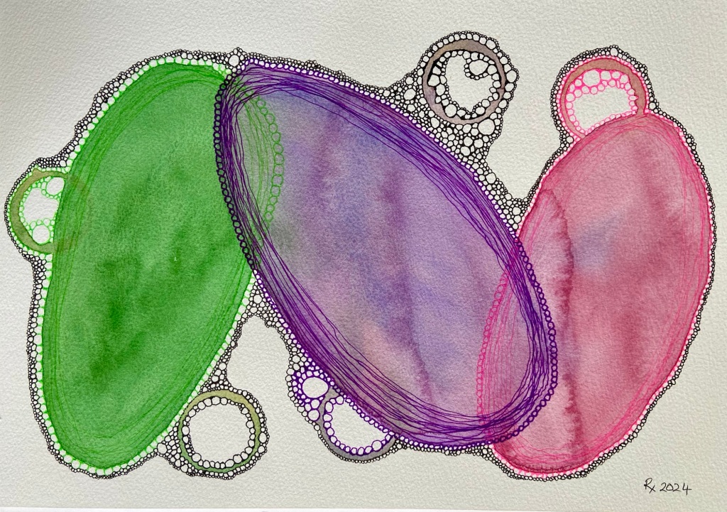
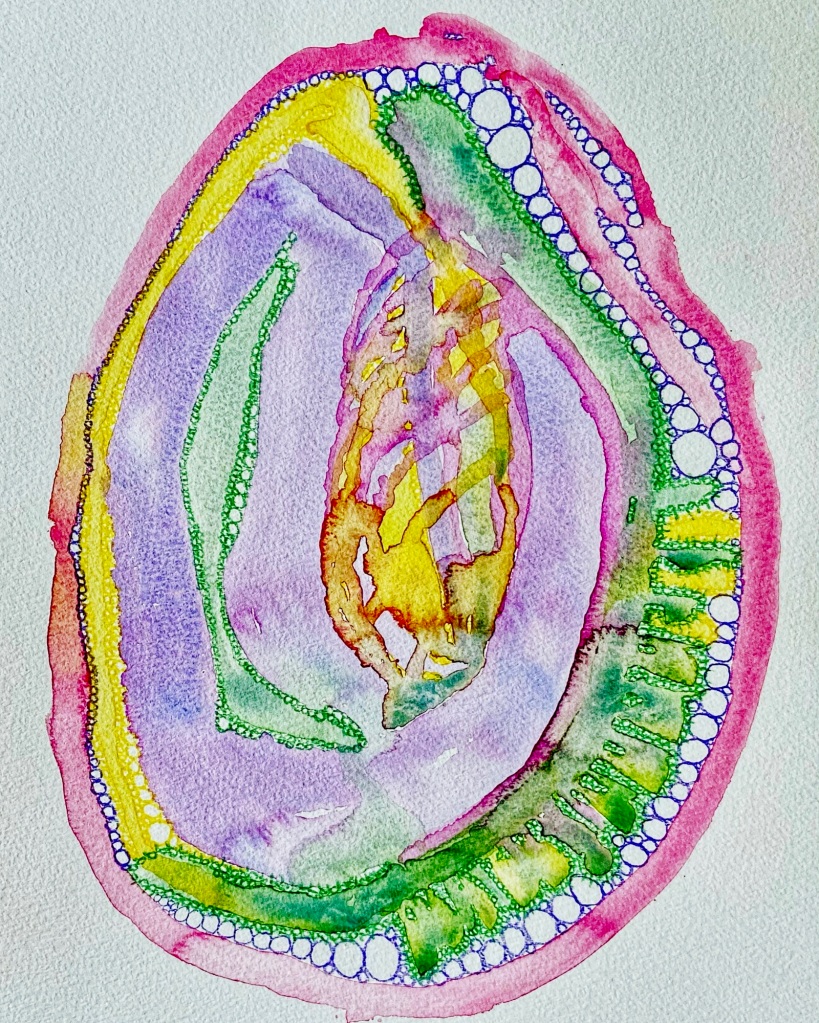
Last Saturday, having gazed at the bookcase from my chair, I was inspired to create something using three ceramic pieces modelled on nature. A leaf, a shell adorned cornucopia, and a hyacinth leaf vase.
I arranged and drew around the objects in pencil then ink. I decided on purple for the cornucopia using the colour of mussel shell for inspiration, predictably green for the leaf, and finally orange for the vase.
On Sunday, I thought the shapes I had chosen worked well together as there was movement between them from the colours intermingling. Wishing to add depth and luminance, I added yellow washes to the orange and green and redid the ink outline.
After deciding the abstract picture was called harmony in nature, I added three black undulating lines to ground and orientate the central image.
I will brazenly prostitute myself for the chance of being rewarded with free stuff. I am delighted if a free cloth bag contains paper and pens. And boy do I hoard them.
Around a decade ago in Sydney, the local office supply company, Office Works were giving customers a bag weighed down with pencils, pens, pencil case, and bookmarks.
The pink, green, and purple ink pens used in today’s mixed media abstract picture are from that boon. I used the pens to outline the ovoids, washed over with watercolour and drew the shapes again on top.
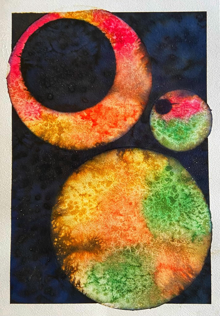
The stamped circles were outlined in Lipton’s decaffeinated tea with paint added while wet.
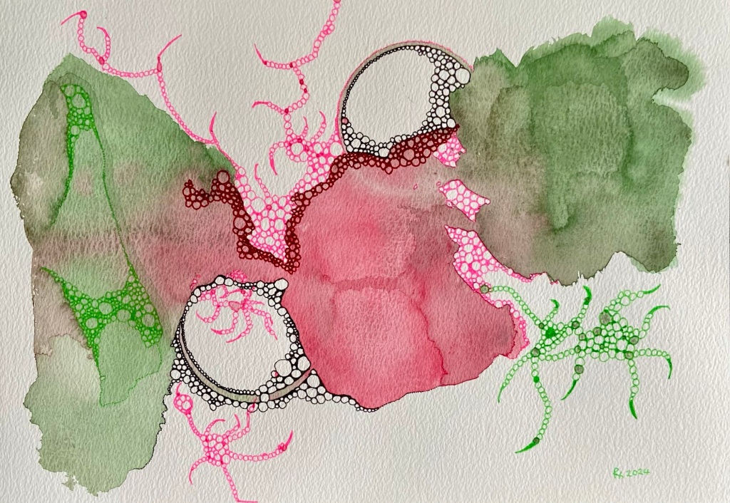
In my mind during the week leading up to this week’s mixed media painting, I thought dark green flowing into yellow. When it came to mixing the colours yesterday, I loved the green so much, I felt pink was needed.
I started the painting in portrait to encourage the colours to flow and mingle.
Last week’s stamped rings were achieved by applying watercolour to the rim of a drinking glass with a brush. This week I dipped the edge of a deeper rimmed glass into paint in a saucer, resulting in more strongly defined circles.
My husband commented the colours looked subdued. I explained they were step one.
With the picture turned around to landscape, I added green, pink, red, and black bubbles. This draws out the creative process and extends my enjoyment.
As it was a warm sunny Autumn day, I took a break yesterday so that we could spend a couple of hours in the spa.
Coming back to the painting this morning, there was very little to add.
One of the artists I follow on Instagram posted a video of the painting of three green, purple, olive solid overlapping circles in portrait. Over this a stem and dense large leaves were added. Using a pen, lines and dots were added to alternate leaves. Then something else was added, I cannot remember what, probably flowers. I would have stopped at the three circles. I liked the simplicity of the forms, the colours, and the spatial calm.
Yesterday, I added green, yellow, and purple pencil bubbles to the abalone shell inspired watercolour from last week.
The original abstract abalone shell reflects my aim for an ‘ideal’ restrained and constrained abstract watercolour. The result evoked a meh response from me. Internally, I wrestled with the original is okay, I may make it worse if I do anything to it. Down the track, I would have earmarked it as a failure, turned the sheet over and painted on the back.
I now love the pimped up version and for the Internet, the addition of a Google Snapseed pop filter. It is sort of my first mixed media picture.